
Overview
AYR website was a common example of an e-commerce site gone wrong - putting aesthetics before users, without realising how much it affects their sales. For this project, I've redesigned AYR's website to create a better experience for their customers, while improving accessibility and usability.
Client: Loughborough University
My role: Usability testing, UX Design
Time: 6 weeks
Tools: Miro, Figma, Excel, Eyequant
Timeline
Context
Company background
AYR (pronunciation air) is an independent clothes company that designs premium products for women. It is US-based, with two stationary stores (New York and Los Angeles). Their products are aimed at women of all ages, and a target client is a smart, strong and independent woman who likes to feel comfortable wearing jeans while also looking professional.
Problem
AYR started falling behind the competition in both performance and satisfaction. The redesign aim is to create a delightful and easy shopping experience.
Approach
Conduct thorough analysis, that will include accessibility evaluation, heuristics, performance and satisfaction measurements. The analysis will be based on e-commerce top tasks.
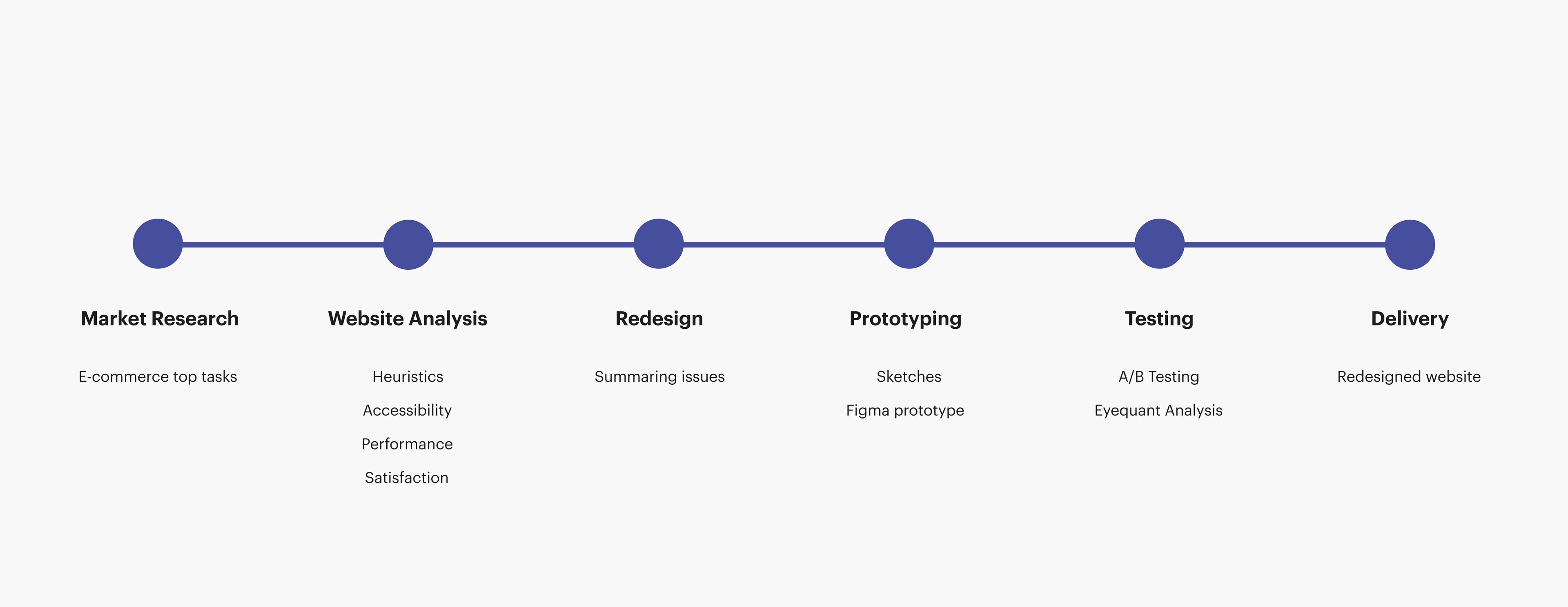
Analysing Issues
Market Research
Introduction
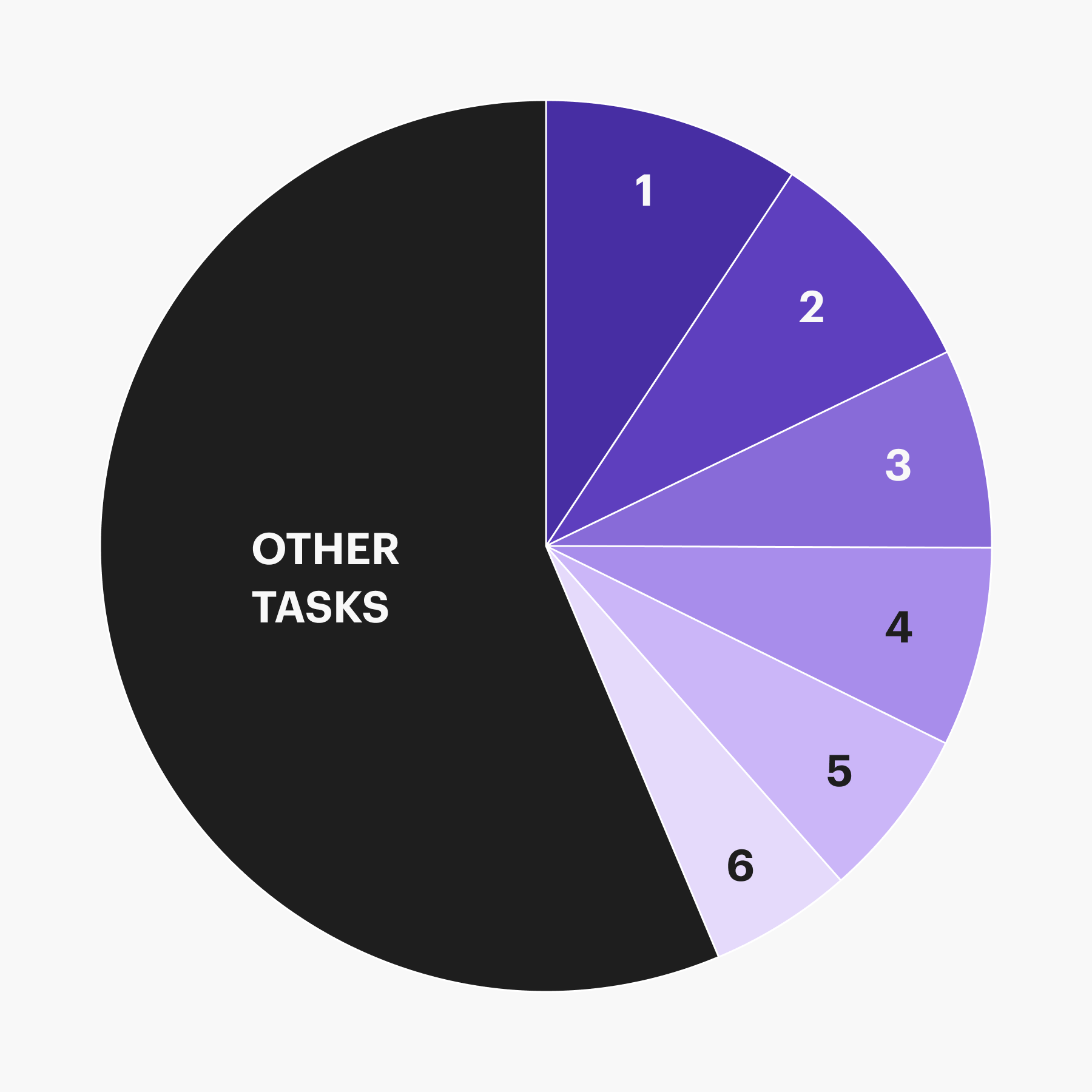
As the focus of the project was not user research, I’ve used existing studies to learn what are the most important aspects of online shopping. These aspects, called top tasks, will form the backbone of the redesign.
E-commerce top tasks
1. Delivery (Free, Cost, Date, Time, Options)
2. Sizing information (fit, measurements)
3. Image (quality, garment, model, gallery, detailed)
4. Product description (style, material)
5. Customer Reviews
6.Filtering (age, type, size, price, colour, brand)
2. Sizing information (fit, measurements)
3. Image (quality, garment, model, gallery, detailed)
4. Product description (style, material)
5. Customer Reviews
6.Filtering (age, type, size, price, colour, brand)
Website Analysis
Heuristics
Evaluation conducted by comparing the website to the heuristic principles made by Jakob Nielsen. Then, I’ve grouped identified problems into minor, moderate and critical categories.
Accessibility
Vital pages (home, product, about and refund/return) were compared to WCAG 2.1 accessibility guidelines for both AA and AAA requirements. Again, issues found were divided into three categories.
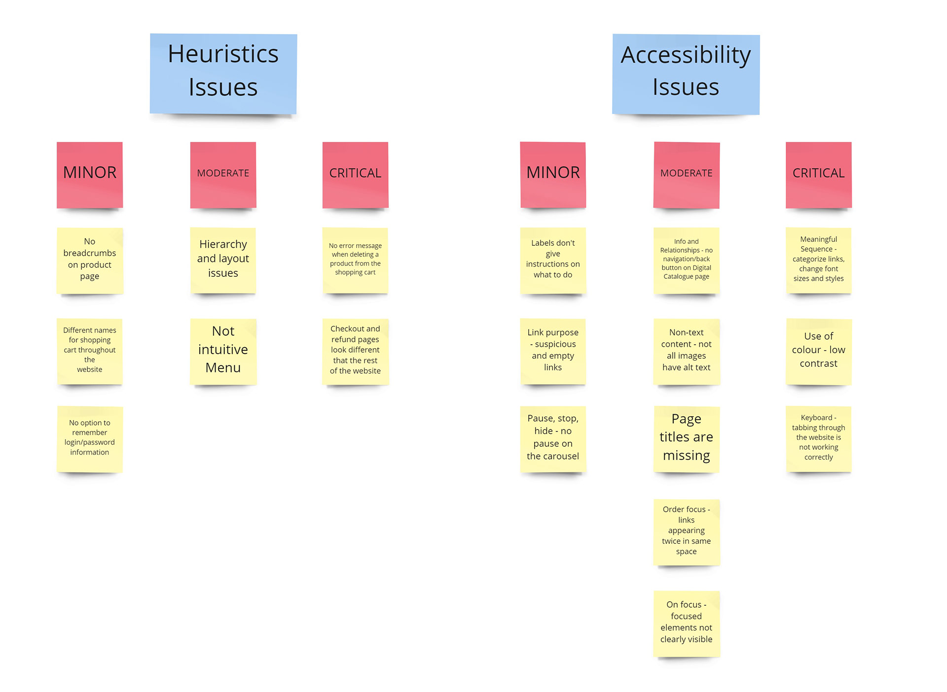
Summary of Key Issues
Delivery
On the current website, details about the delivery were non-existent. Providing delivery information for customers is incredibly important, as according to Baymard Institute, 60% of shoppers in the USA abandon the website when they find that the delivery will take too long or it’s too expensive.
Providing a working solution
Prototyping
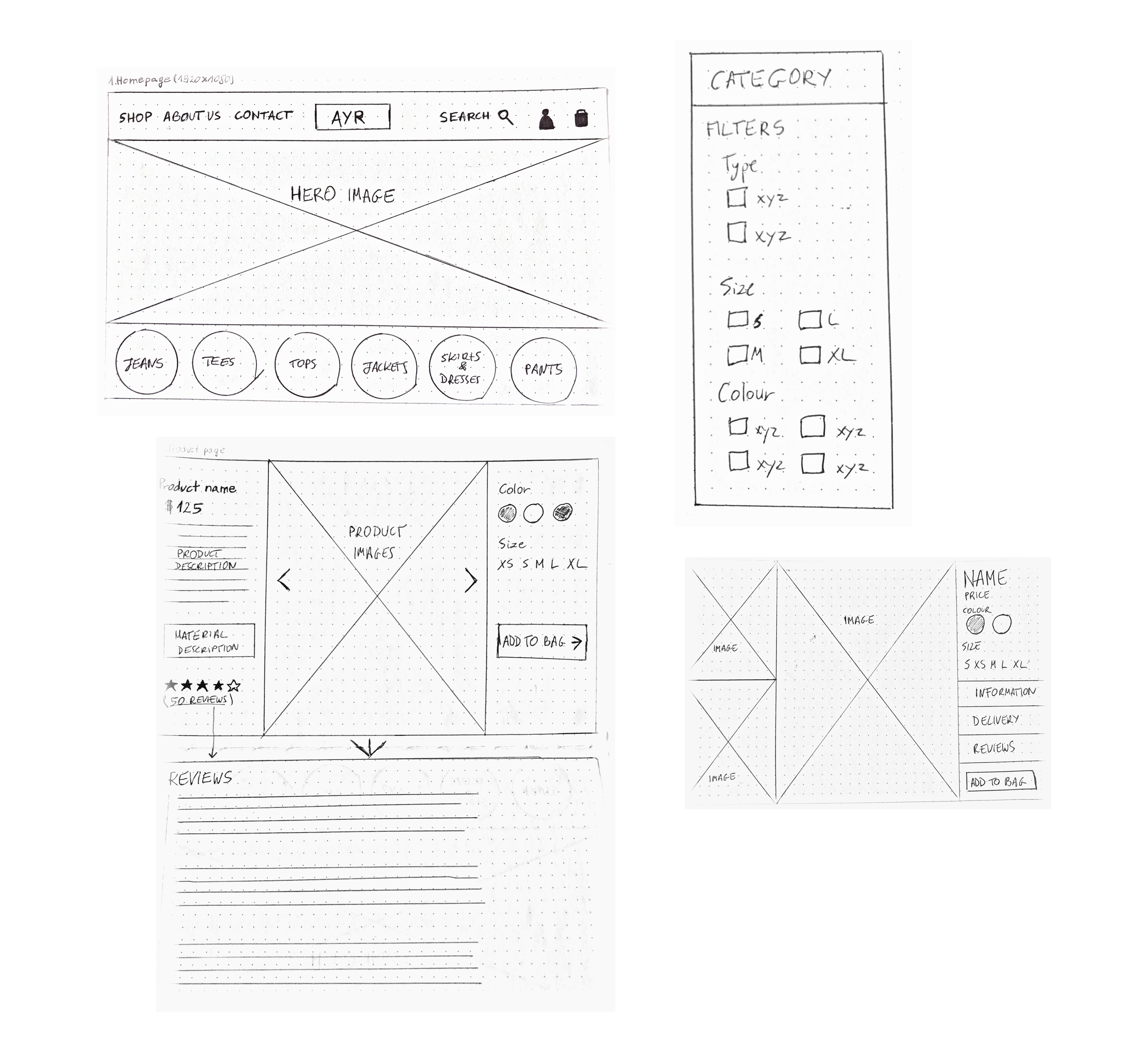
Sketches
I’ve started with simple sketches to ideate how to approach possible changes to the website and highlight what needs to be done to the website to improve in all aspects. At this stage, I wasn’t focusing on making the design pretty - I wanted to prepare a solid base to make the design process in Figma fast and painless.
High Fidelity screens
Due to time restrictions, I had to move straight from sketches to high fidelity screens. I tried to make the prototype as real as possible, with working filters and options to choose from, to ensure that the feedback received during testing wouldn’t be impacted by a bad prototype.
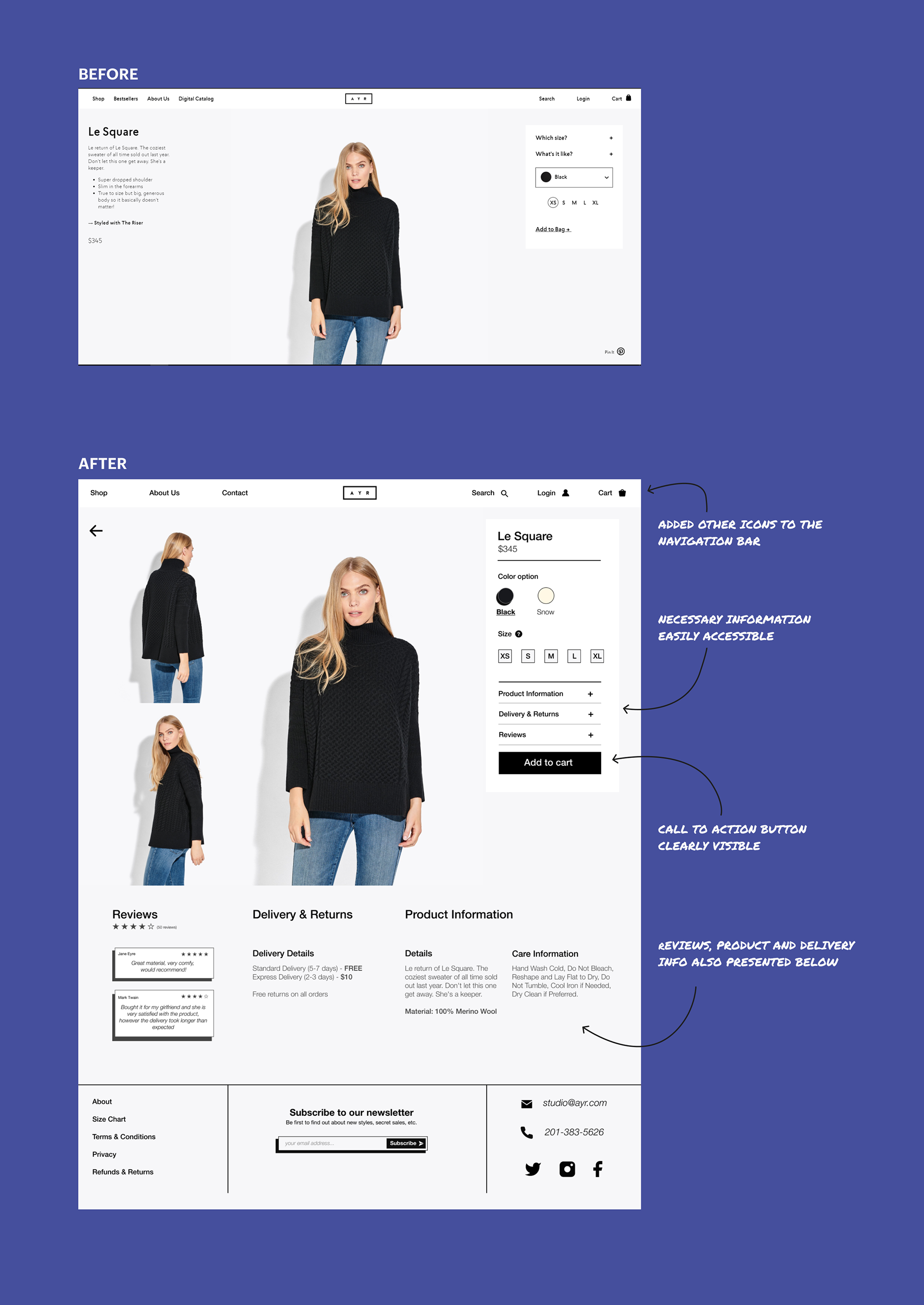
All images used belong to AYR.
All images used belong to AYR.
I’ve included both before and after versions of the product page, as it was offered the most attention and undertook the biggest overhaul. This is not surprising, considering that 5 out of 6 top e-commerce tasks are connected to the product page.
Eyequant Analysis
What is Eyequant?
Eyequant is an AI-driven software that uses neuroscience to provide quick insights on design decisions and help with the iterative process. Data received from Eyequant is presented in the form of heatmaps, which represent the most noticeable areas on the screen. I’ve used it for this project to compare the existing website with the redesign to check if the vital information for the user is now clearly visible.
Results
Testing showed that the redesigned website has more visible categories on the homepage, as well as easy to find filter section and noticeable prices.


TESTING
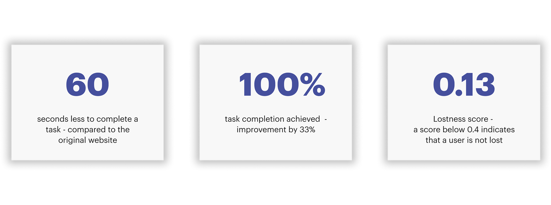
Performance
To test performance, I’ve recruited four testers from the target user group for a remote A/B testing session. They receive the same tasks to complete as the one used for testing the original website. The redesigned version scored much better than the original, and the numbers are here to prove it.
Satisfaction
The main method of measuring satisfaction was a SUS survey presented to ten users. The redesign achieved a score of 87, which indicates that the website is above average compared to the others on the market.
Conclusion
Achieved goals
Overall, the redesign process was successful, and the new version of the AYR website only requires small changes to fulfil all the users’ needs in terms of e-commerce top tasks.
Lessons learned
Redesigning a website is not a one-and-done kind of job, and requires constant monitoring and updating. While the performance and satisfaction increased, there are still areas that may need improvement. For example, providing a clearer way of displaying delivery information, and a more intuitive gallery would be the next steps for the second iteration of testing.